Kerning and Tracking – The (Subtle) Art of Typographic Spacing
After kerning’s recent moment in the social-media spotlight—thanks to the epitaph on Pope Francis’ tomb—we decided to dive deeper into this “fine detail” of typography, which directly affects readability, visual balance and a project’s identity.
Typography is not just about fonts; first and foremost, it’s about space. The way letters relate to one another, both horizontally and vertically, profoundly shapes legibility, visual harmony and the recognizability of a message. In this guide we explore two fundamental concepts: kerning and tracking.
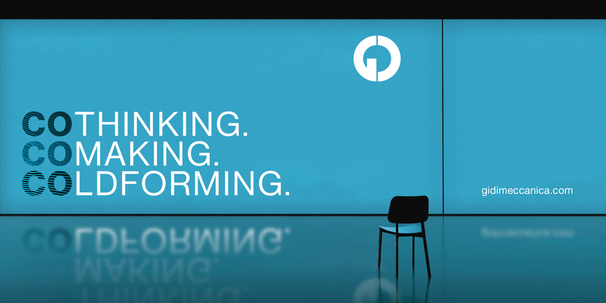
What is kerning?? Kerning is the adjustment of space between specific pairs of letters. It is not uniform spacing but a fine-tuning that makes letter combinations such as “AV,” “WA,” or in this case “RA,” appear visually balanced when they might otherwise look too far apart or too close together.
Why does it matter? Good kerning improves readability and lends professionalism to text. It is especially critical in headlines, logos and large-format text, where every detail counts. Poor kerning can make a logo feel awkward or a title hard to read.
How do you apply it? Most design software (Adobe Illustrator, InDesign, Figma, etc.) lets you adjust kerning manually using metric or optical options that depend on the font and on a designer’s professional sensitivity to visual harmony.
What is tracking? Tracking adjusts the uniform space between all letters in a word, phrase or block of text. Unlike kerning, which targets specific pairs, tracking affects the entire selection, making it tighter or more open.
What is it for?
Tracking is a valuable tool to:
Enhancing readability in small type
Visually balance long paragraphs or headlines
Add breathing room to a layout that feels “dense”
Create a lighter, more technical typographic style
However, excessive tracking can hurt legibility, especially in long texts. As always, balance and common sense are key.
Conclusions
Typographic spacing often goes unnoticed, yet it has a major impact on a graphic project’s communicative power. Mastering kerning and tracking means enhancing readability, conveying precision and strengthening visual identity. These refinements are not mere automatisms; they result from experience, a trained eye and design sensibility — qualities only a professional or specialized studio can guarantee.
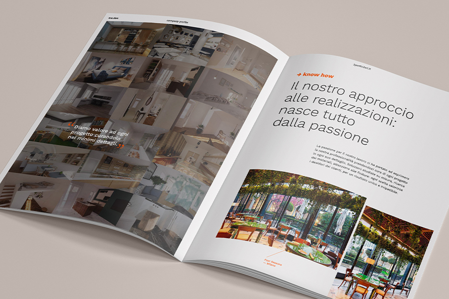
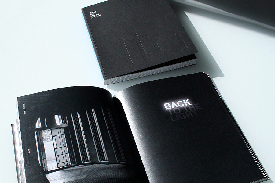
Our decades of experience have taken us through hundreds of projects, each with its own needs, challenges and goals. We understand the value of craftsmanship: expertise cannot be improvised, and every choice—even one as subtle as calibrated kerning or intelligently measured tracking—can make a difference. Entrusting your work to professionals like IDP, means adding value to your visual identity, secure in the knowledge that every typographic element is conceived, tested and refined to communicate at its best.
Because design, like words, needs space to truly speak.